Tuesday


Create a TYPEFACE

The new brief of creating your own type face based on photographs that we've taken.
Typeface, and typography are taking over the illustration world in my eyes. more modern illustrators are incorporating type into their illustration someone using typefaces an the actual illustration. so with this brief it will allow me as an illustrator to show my own typefaces.

i think its important to look at what illustrators and graphic designers are doing today with typeface to give me an idea of what i am competing with

Eleventy Handmade: folded paper typeface

with this typeface, its based around cut and folded cut outs of images and block colours, which is then extended using lines and curves. i like the contrast of the hard edges and the smooth line drawings.

Building block typeface


colour is another aspect that can bring a typeface alive.
Here's a different way in which a type face can be created. using solid abjects that can be easily transformed .

This blog has loads of experimental practise with typefaces .. have a look !
I particulary like this one because the detail they've gone into to transform the angle of perception on this typeface.

This piece of typography just goes to show you ave detailed a type face can be whilst still holding that important, significant structure that we recognised as a letter.


Experiments

On photoshop i picked a random object which happened to be a Dyson vacuum cleaner, and transformed it to create a structure of the alphabet. It took so long trying to manipulate each piece to make it look like each letter. Here is what it turned out like.

Dysons cam easily be recongised by the strong colours frequently feature in the design, as well as an unusual design compared to the traditional vacuums. 

Creating a curve out of an object that has mainly strong straight structure parts, is what i found most tricky. But i was lucky enough that Dyson have many models of vacuum, that come in various shapes and sizes. This is a subject matter that truck me to be more interesting than i originally thought.

Using photoshop i was able to construct the whole Alphabet using single Dyson Machines to represent the original forms of the Alphabet. 
The outcome of this was more visually appealing than looking at a straightforward Dyson. out of all my methods so far i think this one is more interesting to look at as well as slightly more complex.


Can You See What They Are ? 


Carring on from my vacuum typeface, i started to create the type itself out of the physical object. Using the lead from the vacuum i created A-R. these images to me do what i planned out, but are visually interesting. They lack colour and texture. Although they do create negative space that maybe could be worked on to uplift them from a basic flat image.


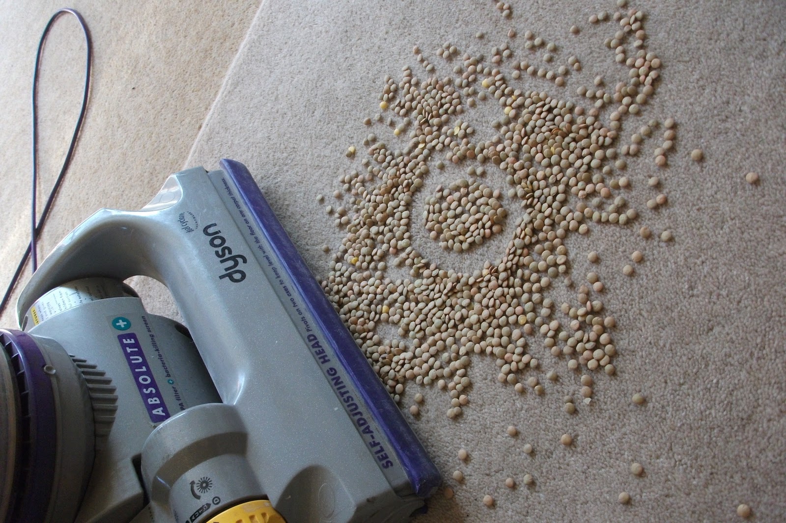
Here's is another experiment i've done. This time including other aspect that are linked toward the dyson. The "cleaning' part. taking the idea of a mess on a carpet and creating the type from that. The type is clear and is bold. This method would also work with the number's 1-10 as and type can be selected out of the mess. But is this the best ? 


Wednesday

ZINE WORKSHOP

The A5 Zine

making a zine out of photographs that construct a sequentialnarrative around them. different processes needed to help me tell this story.
 well here are the photographs


But my problem is.. i can only have 6!!!

I thought about the narrative behind the photo's and i came up with a rough sketch of ' A Journey'
these images origanly came from my own jounrney back home from uni.
It consits of pathways, footpaths, road crossing, and meeting weird new people.
with these images i could create a weird random journey, the weird things i come across, the random thoughts that come into my mind.
im just going to let it flow through the zine.

Monday

Brief 2
Postage stamps
The fashion Industry in the UK is renowned worldwide for it creativity and influence, both in the past, and in the present.
The aim of this brief is to celebrate that influence in a visually exciting way that would be a joy to use on post.


Alexander McQueen


McQueen has been an influence to me for years. his death bench marked an important moment in fashion history. McQueen had a lot going on in his life and his mother was a big part of that. when his mother died Alexander found it virtually impossible to live without her. which spiralled out of control and resulted in his own death. Alexander McQueen will still be an influence to me even though he is no longer with us. 
these are just a few of his creations that stand out amongst his latest catwalks.


McQueen has a hard edge style. Creating a piece of art that can be worn out of every day objects, like tyres, and bowls.
McQueen always pushed the boundaries and expresses all his tailoring and other skills in every piece. He is a designer that can never be replaced and his work will be seen all over the world just like a postage stamp.


After researching into the life and work of McQueen i decided to explore his work using different materials. Mixing sketches with paint, and different paper i created some rough drawings.
in McQueen's work he includes several references visually and nature, and animals.
he uses fur, feathers, flowers (like above) and even antler horns.
as you can see once shrunk down an image can loose all its texture and detail
this is a classic example of McQueen outrageous talent. a full length dress made in white feathers.
the pretty girl look isn't normally what McQueen would design. but with this piece he add a graphical design within the fabric print.
this graphic print has more of a futurist touch.
something that has a big influence to his ready to wear range.
these are 3 of the design iv decided ton use as my stamp.
iv chosen these because i think they explore what i believe Alexander McQueen is all about.
Designing the outrageous and the Pretty girl with a twist. he has so many skills, and having designs that vary is one of them.

Here are some of my sketches turned into paintings, with a few new editions..


These are some experimental sketches. Originally these were going to be my finals, but staying true to my designer, Alexander McQueen i thought it wasn't appropriate not to include colour. As its a major aspect in many of his designs.

This is the final set.


Thursday

"Nothing of me is original, i am a combined effort of everybody i've ever known"

the big reveal!

Hey all,
i told you i would give you a sneak preview of my recently transformed, "love in the city" project.

Here are a few of my images that i came up with whilst in the recent anger of each argument.
each image is a pure visualisation of whats going on in my mind. 
well here you go ...

 Ever felt as if there was a "pointless" mood. well every time we would argue all he would do is fall asleep as if nothing had happen. Leaving me just sitting there, back to back. all so pointless. The idea of sharing a bed is the same as shearing your love. Love was not spread that evening so the sharing bed part was not needed. All i wanted to do is for him to go away and realise what happened. I felt empty, upset, and disappointed. Nothing around me mattered. I wanted love.

This is a version from photoshop. The textures,  adds that harsh tension.
wWith this one i had enough. felt as i i was always doing something wrong. I was never right. When i slipped up he would make sure to rub it in my face. I felt useless and there was nothing i could do that would change that. I had so much to let out and release but he never aloud me to speak because he would always answer back and reject what i had to say. My head was bursting with stuff that needed to be release in and big scream. So i did.


Wednesday

It's been a while... lets catch up

so i know i haven't been updating you for a while.
so much work has happened,
but the big news !

Love In The City is no longer. iv totally scrapped that idea.
after a long tutorial, discussing my idea and the fact its to easy and does flow made me realise that that project was going NO WHERE. but don't worry i came out of there with my chin up and ideas buzzing.
john in my tutorial asked me if my story board was based on real life. it wasn't based on my own experiences but just the general concept of how love comes and goes.
This made me think.
Although my central idea was to create a book using just fingers as my characters i wanted to explore in depth this whole "love" idea, and the only way to understand it, was to talk about my own life and my very current relationship which has gone sour.

i set myself a goal of writing down every argument me and my boyfriend (Connor) had. You may be asking yourself why arguments? why not the "happy" times ? well that might be because i cant remember the last time me and my boyfriend had a good time and didn't argue. so I'm being real within what my relationships about, and what I'm currently experiencing with my love life.
arguments are very personal, and have deep hidden meanings, and all I'm doing is writing exactly what I'm thinking.
although this is very personal to me i thought its the only way to succeed
for each argument i sat and rote in my journal and then drew what ever pops up into my head. These images will be my final. The final product of what I'm going through and my own understanding of what makes Love work.

right there you go.
that's what i have done.
stay in touch and you will son see these images !!