Thursday

New 1 Week Breif.

" Nothing of me is original. i am the combined effort of everybody I've ever know."
Chuck palahniuk

my response to this quote is:
Is anyone Original?

  • The fact that no ones experiences are exactly alike and therefore everyone is technically different ?
  • we are a product of our surroundings?
  • what does original mean to you ?
  • we may contain the same stuff but we are unique pattern that is different from everyone else.
  • we are 100% as original as everyone else
  • i am nor original i am unique
Because this is just a 1 week brief its important to just blast my instant ideas down and start from there.
we are all unique in the way we all have different DNA, and the patters in life are never the same? 


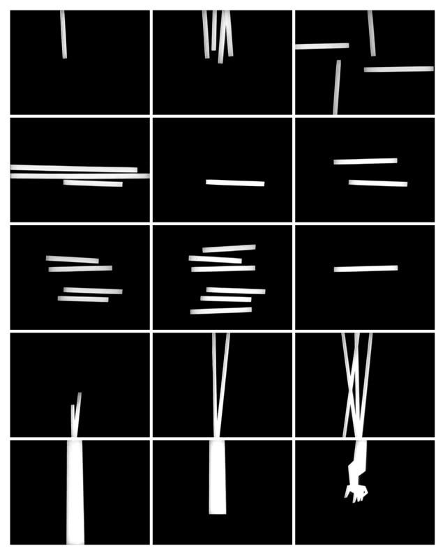
for me the words/sentence are so important i dont want the power of the type to be over run by a power image. i want the type to do the talking.

typography has always been an element of design that has truely insipred me.
typography is the future of illustration. its a major aspect that needs to be recognised!
type and image need to bond for any composition to work.

so i was thinking for this im just going to reproduce this exact statement with creative text and maybe a simple image that can be combine to reflect the idea of purity, natural form, and surroundings.

Monday

My new favourite Illustrator! big influence for me at the momet with both my projects!

About Ottobooks:Otto has been self-publishing artists' books since 1995.
He also illustrates for international newspapers and magazines, specialising in political and economic subjects.
Accordingly, his books are illustration-based, the visual narratives dealing with social and political issues

Self-publishing is very important to otto.
For Otto, self-publishing has been the only way to distribute unconventional content, and to meet his high quality production demands. The creation of the books from conception of imagery through to the printed page is one continuous process. Printing is simply the final phase of image-making.

Text and image
In his books, Otto rejects the traditional form of accompanying text with illustrations. Instead, he treats text as part of the image to form an integrated unit, both conceptually and physically.

Here are just a few of his self published books.


ottobooks, chairs poemottobooks, chairs poemottobooks, chairs poem


 ottobooks, chairs poemottobooks, chairs poemottobooks, chairs poem

ottobooks, chairs poemottobooks, chairs poemottobooks, chairs poem

with my own images i find it hard choosing the colour pallet. but these have it spot on . because his main way of image making is printmaking and screen printing, selecting a selective colour pallet is very important. to help the process to run smoothly and not to complicated it.
so looking at his work always makes me think about what selective colour is needed and what will work well as a combination.

Its been a while! but here are my inspirations ! Abstract Comics

This book was my total inspiration for my comic !
i defiantly recommend it if you ever want to be inspired when it comes to comics and story boards.

This book defines what comics can be. They push boundaries, and even destroy any rule book when it comes to creating a comic.
Ill show you exactly what i mean, here are just a few examples from the book.

journey_abcomics_clear1.jpg
Can you see what i mean ? they all have that structure about them that hint upon the idea of comics. but they totally destroy every commercial comic, well in my eyes they do.
i didn't want to go looking for inspiration from the traditional comics, because i didn't want to create something that's already been done. For me these were so much more interesting.
obviously i could never do something so abstract as these because i have a specific message i want to portray. But the layout and media will let me explore these creative formats.
search for abstract comics blog, i found it very interesting and it really helped me push my creative side out.

Wednesday

Love in the City developement.

Originally i had the idea of setting my love scene in the city, because of modern living and the surprises it brings. due to further development with my story board. i decided against the strong theme of the city. to lock down on a specific theme was a good idea at the start but when looking into it realistically, the story would be too long and complicated to do successfully in the amount of time that i had. 3 weeks !!!


After developing my basic imagery i decided that the 'city' part of my story wasn't as important and took over the idea of love. so there no preference to location except in certain scenes where a location is needed.


mixing ink, water colour and my text together to see if colour would create an interesting image.
i think it works. but i want my comic to have a interactive feel to it. i want layers and more textures.
and reflect on the modern day setting.


part of my crit was realising that i needed to be more specific with my characters. These fingers need have elements of interaction between them, as in body language and form. I have a male and female bond in my story so it is important that the viewer can distinctly recognise which is the female and male.


I now have my scenery and my characters the next step is putting them together. These are a few of my experiments with mixing me media, text and colour in different compositions.
Each one holds specific imagery that expresses whats going on in each segment of the story.


I find modern simplistic imagery very effective. less is more. which is what i feel these selct compositions reflect, but the background doesn't hold a strong link to the theme of love. maybe a change of colour to change the mood, or introduce block colours.

Monday

Abstract Comics - "Love In The City"

At the moment i am trying to perfect my story board involving two separate fingers that seclude the busy life in the city for one day to, fall in love and then go their separate ways.
i want to do all this is a way that defeats the stereotype of what a comic looks like.

The book Abstract Comics is a big inspiration for me at the moment. it features many artists that go above and beyond the guide line of how to composed a comic.


all three images don't include any narrative or wording, but yet you cans still follow a lead and create a beginning to an end. Exploring with textures and media these comics come alive in what it holds within the page. Something i am hoping to recreate in my own comic.